A landing page that converts doesn't happen by chance: here are all the elements to include, how to make it visible on Google and citable by generative AIs, the most common mistakes, and a ready-to-use final checklist.
You've invested budget in advertising campaigns, the traffic is coming in, but the leads aren't. The problem, often, is not the ad: it is the page the user lands on.
A high-converting landing page It is not a question of graphics or personal taste. It is the result of a structure accurate, designed to answer in a matter of seconds the questions users ask themselves before leaving their details or completing a purchase: Where have I ended up, what do you offer me, why should I trust you and what do I need to do now?
In this article we look at the elements that cannot be missing in an effective landing page, how to build it with SEO and GEO in mind, which mistakes to avoid and how to check, point by point, that you haven't forgotten anything.
A landing page it is a standalone webpage, designed for a single goal: to get the user to carry out a precise actionrequest a quote, book a demo, download a resource or buy a product.
In a nutshell, the goal is conversion.
Unlike a homepage, which must tell the story of the entire company and offer multiple navigation paths, a landing page eliminate distractionsno cluttered menus, no multiple links and no escape route other than the conversion itself.
The homepage is designed to to welcome diverse audiences with different needs: those looking for information about the company, those wanting to see the services or those looking for contacts. The landing page, on the contrary, speaks to a single person, with a single need, at a single moment: the one where they clicked on an advert, an email or a social link.
That is why an effective landing page (almost) never has a full navigation menu, and often Keep internal links to a minimum as well which do not lead to conversion.
A dedicated landing page is needed every time there is a specific campaign, offer or audience to be separated from the rest of the site: the launch of a new service, a limited-time promotion, a Google or Meta Ads campaign, an event or a lead magnet.
If, on the other hand, the goal is general, such as presenting the company, its services and its positioning, the most suitable page remains the website as a whole, with an SEO and GEO structure designed to intercept broader, organic searches.
Before seeing how to build an effective landing page, it is worth understanding why most it doesn't work.
In most cases, the problem is not the design, but one of the following points:
Any of these points, on its own, can drastically lower the conversion rate.
Together, they can reset it to zero.
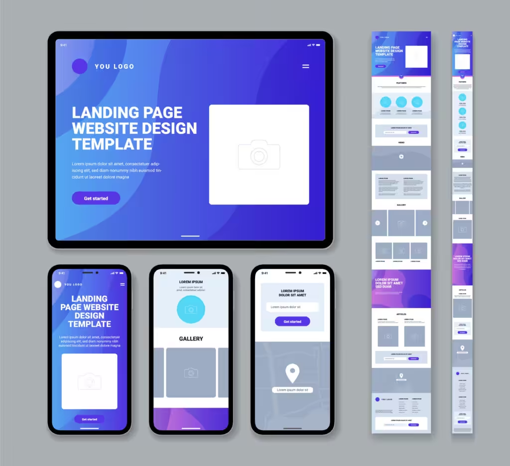
A landing page that converts follows a strict hierarchyeach block has a task and brings the user one step closer to conversion.
The headline is the first thing the user reads, and often it is also the’sole, if it fails to capture attention. It must immediately answer one question: What do I get by arriving on this page?
An effective headline communicates the main benefit, not the feature of the product or service: not “order management software”, but “manage your orders without any more manual errors”.
The subtitle's job is expand the promise: it adds a detail, a number, a context that the title cannot contain for reasons of brevity.
the foldabove the fold), it must contain everything needed to understand where you are: headline, subheadline, an image or video consistent with the offer and the main call to action.
It is not necessary (and is often counterproductive) to include multiple CTAs with different text in this section.
One sole objective, one single button, one single message.
Immediately after the hero, the page needs to explain clearly the value of the offerwhat changes for the person carrying out the requested action, why this solution is different from the alternatives, what makes it credible.
It is time to answer the question that every user asks: “why should I choose this exact solution?”
No promise, however well written, is as convincing as a tangible evidence.
Real testimonials, client or partner logos, numbers (completed projects, years of experience, measurable results…) reduce the distance between “sounds interesting” and “I trust you”.
Better a single detailed and verifiable testimony than ten generic sentences without face or context.
A frequent mistake is describe the product rather than the result. Listing technical features says little if it is not clear what actually changes for those who use them.
The difference is simple yet decisive: “CRM integration” is a feature; “you never lose a contact again because everything is already synchronised” is a benefit.
And remember: the copy for a landing page should always address the reader informally, not to the company's 'ego”.
Every user, before converting, has doubts: Is it secure? How much does it actually cost? What happens after filling out the form? And what if it doesn't work for me?
An effective landing page anticipate these questions, instead of ignoring them. You can do this with a dedicated section, with micro-copy near the CTA (“no commitment”, “response within 24 hours”) or with a dedicated FAQ.
The form is where the conversion it becomes real or it gets lost. Every additional field is a potential reason for abandonment: the rule of thumb is to ask just what is needed for the next step.
If the next step is an introductory call, name, email and phone number might be enough. If it is a more complex quote request, it can make sense to ask for a bit more information; but always evaluating the trade-off between contact quality and completion rate.
On longer landing pages, the call to action goes repeated several times, not just above the fold: after the value proposition, after the social proof and at the bottom of the page.
It is not a matter of “pushing” harder than necessary, but to give the user the ability to convert at the exact moment they feel ready, which could be after 5 seconds or after reading the whole page.
A well-written FAQ section reduces the final frictionit answers the most practical questions (times, prices, methods, guarantees) precisely at the moment when the user is deciding whether to act or abandon.
In addition to the conversion benefit, FAQs have significant SEO and GEO value, as we will see later.
A landing page can have the perfect copy and still not convert, if technically it doesn't work: if it is slow, if it is not readable on smartphones or if the buttons are difficult to tap on small screens.
The design must be mobile-optimised or mobile-first, with short text, well-distributed white space and a visual hierarchy that guides the eye towards the CTA.
The data speaks for itself: according to a Google study, more than half of mobile visitors abandon a page that takes more than three seconds to load, and the likelihood of users abandoning the site increases by 32% as soon as the loading time rises from one to three seconds.
For a more in-depth look at this topic, we have dedicated an entire article to why a slow website loses conversions even without obvious complaints.

Branding, social media, graphic design and digital advertising: we build consistent and strategic communication to grow your project.

A landing page is often created for a paid campaign, but this does not mean that SEO and GEO Not at all. On the contrary: an optimised structure makes the page more robust, faster to load and easier to understand; for Google, for users and for generative search engines alike.
Even an advertising landing page should have a title consistent with the offer, a Meta description persuasive, a’Short and readable URL and one heading structure logic (a single H1, H2s for the main sections). This not only helps with potential organic ranking, but also improves the consistency perceived by the user and the quality estimated by ADV tools.
Generative search engines (ChatGPT, Gemini, Perplexity) tend to reward clear, structured and easily extractable contentdirect definitions, bulleted lists, FAQs with self-contained answers and verifiable data.
A landing page designed also with a GEO perspective doesn't change its nature because it remains focused on conversion, but build authority it includes elements that are difficult to replicate: real figures, case studies and direct experience.
We discussed this in more depth in the article on how strategic copywriting drives visibility in the era of GEO.
Let's start with the first dogma: Not all landing pages should be indexed.
The pages created for time-limited campaigns, with temporary offers or duplicated across multiple variants for A/B testing, should be set in noindex, to avoid duplicate content or “orphan” pages that remain online even after the campaign has ended.
Landing pages designed to last over time, such as those linked to a stable company service, can and they should to be indexed and optimised as a fully-fledged conversion page, to also benefit from organic traffic.
Before publishing (or after an audit), check that your landing page has:
Even with all the right elements, certain mistakes can compromise the result:
In Wegg Agency we build landing pages that combine strategy, persuasive copywriting, design and SEO/GEO optimisation, combined with the expertise of digital marketing and WordPress website development of our team.
Remember that an effective landing page stems from a’target audience analysis and is built thanks to a strategy helpful in achieving your objective of conversion.
To clear up any remaining doubts, we’ve answered the most frequently asked questions on this topic.
There is no ideal length: it depends on the complexity of the offer. For simple products or services that require little commitment, a short page with a headline, benefits and a call-to-action may be sufficient. For more complex or expensive offers, a longer page (featuring social proof, handling of objections and FAQs) helps build the trust needed to drive conversions.
The ideal number of fields depends on the next step in the user’s journey. If the aim is simply to establish initial contact, a name and email address may suffice. If the enquiry is more specific (e.g. a premium consultation), a few extra fields may be useful, but every additional field reduces the completion rate, so the trade-off between lead quality and conversion volume must always be weighed up.
Generally speaking, no. A website needs to cater to different audiences and purposes, with multiple navigation paths; a landing page, on the other hand, has a single objective and minimises distractions. Using a page from the website as a landing page for an advertising campaign, without adapting it, tends to reduce the conversion rate.
It is measured by first defining a specific objective (contact, purchase, sign-up or download) and linking it to analytics tools such as Google Analytics or Google Tag Manager. The key metrics to monitor are the conversion rate, the cost per lead, user behaviour on the page and interactions with the CTA.
It depends on the complexity of the project, the amount of content to be produced and the level of customisation required. A simple landing page takes less time to produce than one that incorporates advanced forms, automations or multimedia content. An initial analysis of the audience and the objective helps to estimate realistic timelines.
A landing page should always be considered a starting point, not a final result. A/B testing (on headlines, CTAs, images or form structure) allows you to understand what really works with your audience, instead of relying solely on guesswork or generic best practices.