Join the wegg side!
Entrust us with your project: we will make it memorable!
CONTACT US
FOLLOW US

Join the wegg side!
Entrust us with your project: we will make it memorable!
CONTACT US
FOLLOW US
Join the wegg side!
Entrust us with your project: we will make it memorable!
CONTACT US
FOLLOW US
Join the wegg side!
Entrust us with your project: we will make it memorable!
CONTACT US
FOLLOW US
SECTOR
SERVICES
TECHNOLOGIES
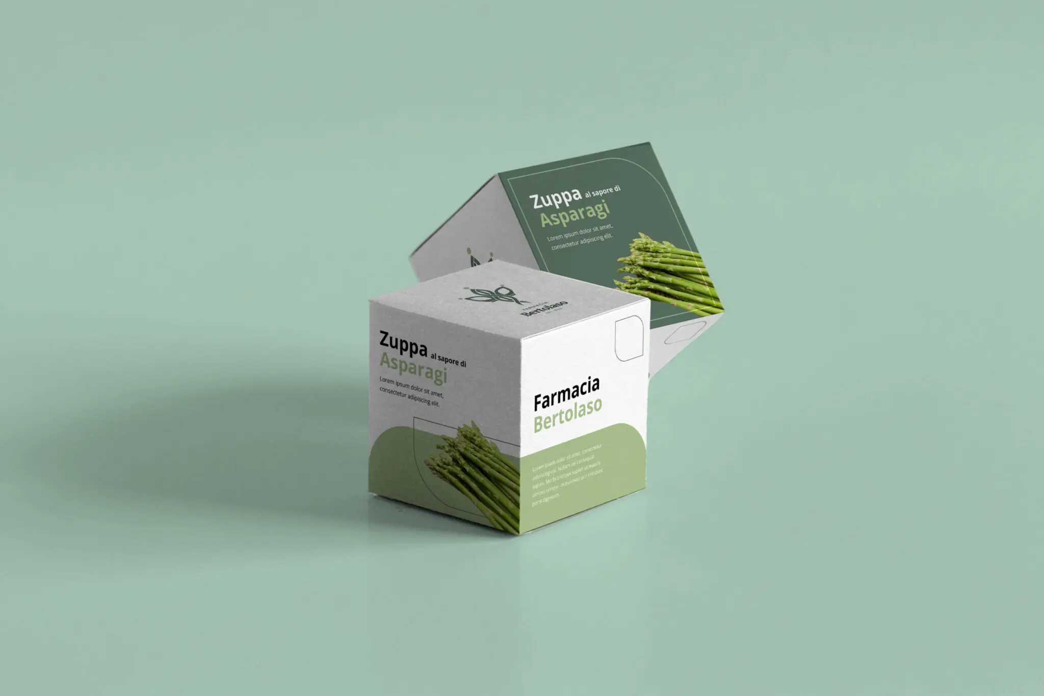
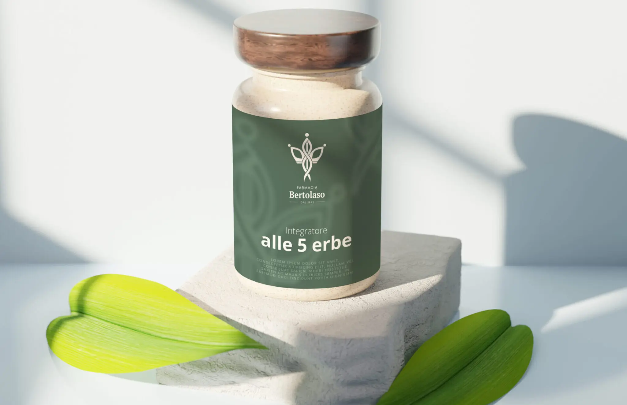
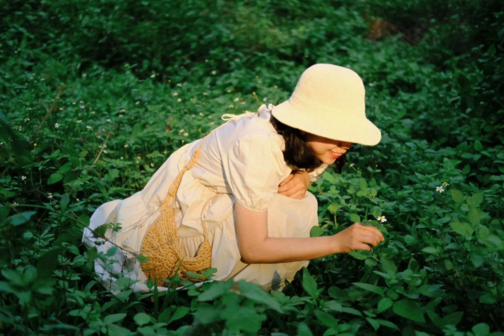
Farmacia Bertolaso is firmly rooted in the local area and has always been attentive to people's wellbeing at every stage of life. With a modern vision of health and an integrated approach that ranges from skin and hair to nutrition, the pharmacy has chosen to evolve its image while keeping firmly rooted in tradition.
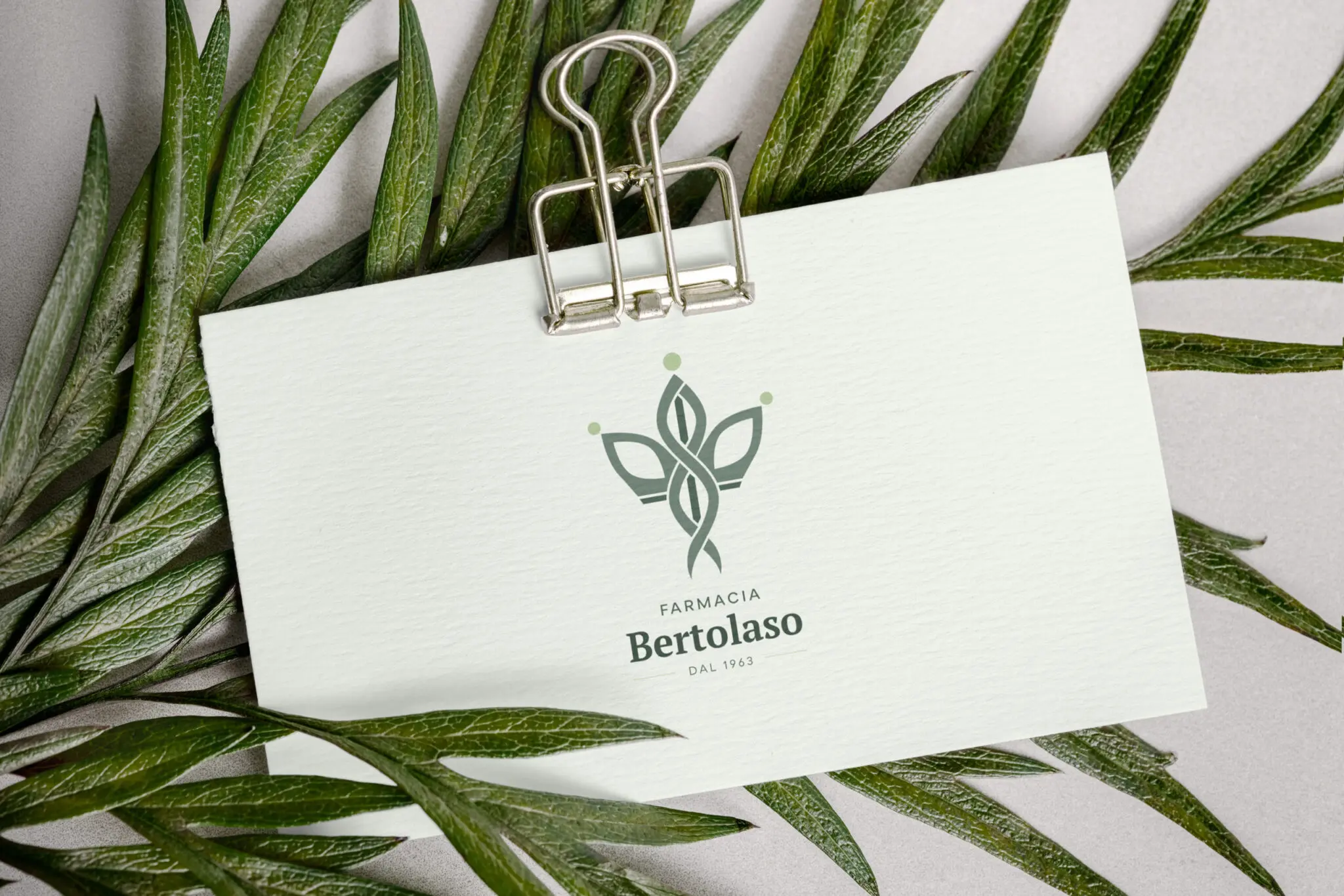
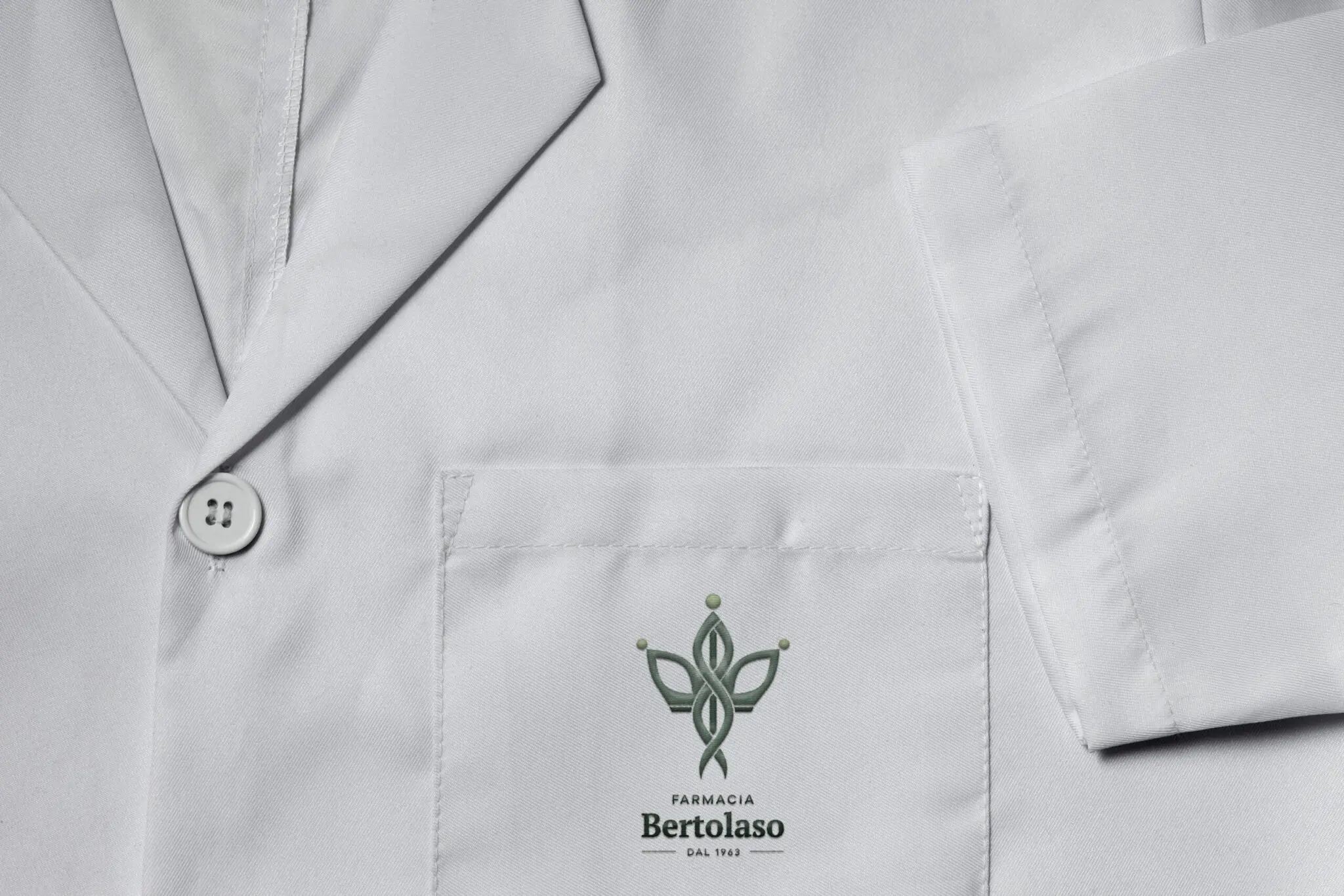
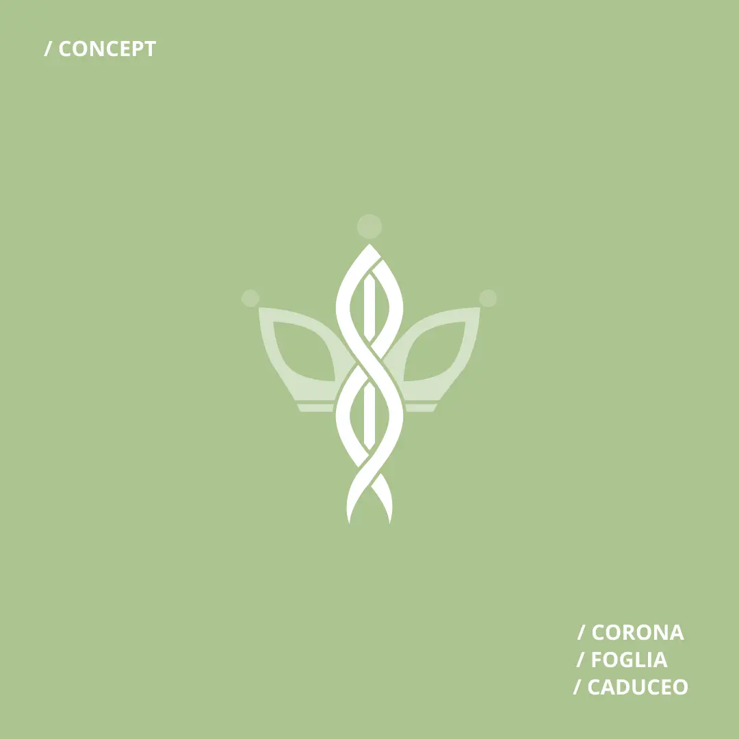
The new logo was born from the union of three symbols: the crown, the leaves and the caduceus. The crown, with its three points, represents the pharmacy's main areas of intervention (skin, hair and diet), as well as evoking the pharmacist's power to guide the patient towards wellbeing. The leaves recall the natural and phytotherapeutic world, while the caduceus - revisited - adds authority.

GOAL
The aim of the project was to renew the image of the Bertolaso Pharmacy, without distorting its historical identity. The client wanted a brand image that communicated professional authority, attention to the person and an integrated approach to health. Wegg Agency worked to create a visual identity capable of expressing all this in an immediate, recognisable and consistent manner, in both physical and digital channels. The rebranding aimed to strengthen the link with long-standing customers and at the same time make the pharmacy more attractive to a wider, more contemporary audience.
TECHNICAL SOLUTION
To represent the new identity of the Bertolaso Pharmacy, Wegg Agency undertook a design process guided by listening and co-design, starting from a series of different visual proposals to arrive at a powerful symbolic synthesis consistent with the client's values.
The concept is based on three key elements:
Around these elements develops a cross that embraces and unifies symbols: a graphic gesture that represents the pharmacy's mission to care for the person in an integrated, harmonious, visible and recognisable way.
During the creative process, Wegg Agency explored various visual directions - more technical, more natural, more minimalist - constantly confronting the client until a unique visual identity emerged, where each element is not just decorative, but carries a meaning.
The result is a solid and versatile brand system, capable of communicating on all touchpoints: from signage to shopping bags, from packaging to digital materials. An identity that strengthens the bond with the historic clientele and at the same time opens up the pharmacy to a contemporary, more empathetic and distinctive dialogue.
RESULT
A renewed visual identity that conveys trust, professionalism and personal attention
Greater communication coherence across all channels
Enhancing the pharmacist's specialisation and role as a guide in everyday health.